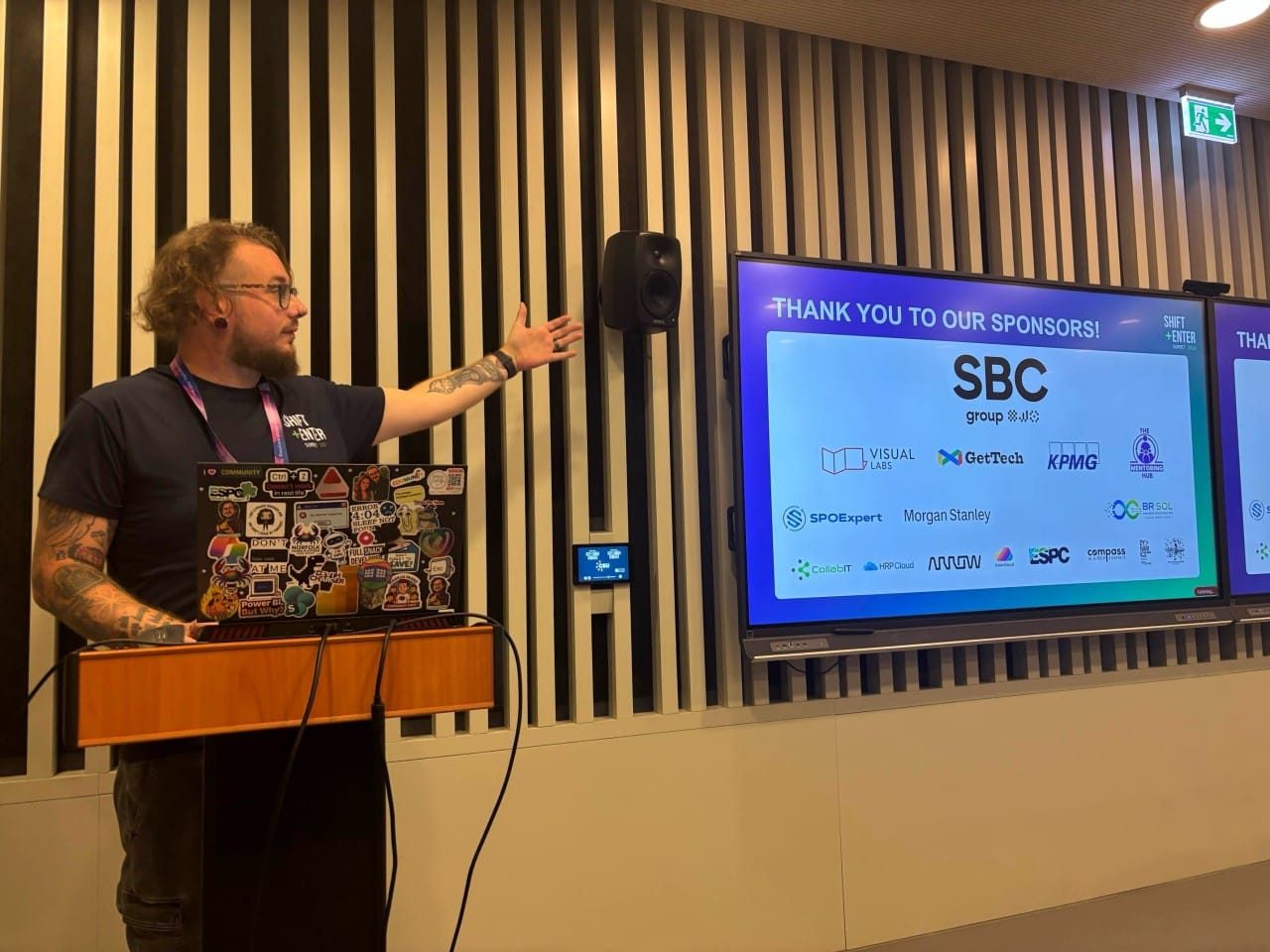
I got back from Budapest a few days ago and I am still thinking about the colours.
Not the city, although we will get to the city. The colours on a dashboard that an AI built while I was stood in front of a room of about forty people building my own.
Let me back up a bit.
Shift+Enter Summit
Shift+Enter Summit 2026 ran on 4 September at Central European University in Budapest. Five rooms, four tracks, everyone together for the keynote at nine and a raffle to close it out. The lanyard said "Our connection can change everything. Start here", which reads like marketing right up until you have spent a day in the corridors and worked out that they meant it.
I have spoken in a few countries this year and the thing that keeps catching me out is how similar these rooms feel once you are actually in them. Different language on the signage, different sponsors on the wall, same people underneath. Same questions in the corridor afterwards, too, which is usually the bit I enjoy most.
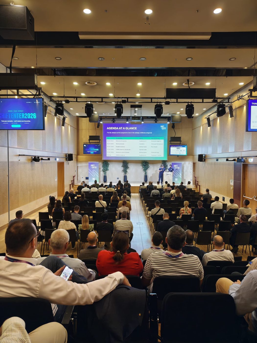
The session
Mine was called "Dashboard in a Day? Nah. Let's Do One in 45 Minutes."
The premise is not complicated. Dashboard in a Day is a good format and I have nothing bad to say about it, but a full day sets an expectation about how long this work takes, and that expectation follows people back to their desks. So I wanted to compress it. Ingest the data, clean and structure the model, build the core measures, get proper time intelligence in, assemble and polish the thing. Live, on the clock, with everything that goes wrong left in.
The data was the Superstore sample, which is a fictional retail chain borrowed from the sitcom of the same name. Orders, customers, categories, regions, sales, about 9,800 rows of it. All made up, nothing to anonymise, and anybody in the room could go home and build the same thing that night.
The brief was a mid-sized distribution company wanting a single page for its leadership team. Total revenue performance. Whether sales are going up or down month to month. Which categories earn the most. Which regions are strongest. Who the biggest customers are. Executive-ready, clear at a glance, no interaction required to understand it, and built inside the client's brand palette rather than despite it.
That last one matters more than it sounds, and it is the bit that ended up being the whole story.
The bit I did not tell them until slide eight
While I built mine live, an AI was building its own report from the same dataset against the same brief on the same clock. Claude, in this case, working in a PBIP project rather than clicking around Desktop.
Same data. Same 45 minutes. Both on screen at the end.
I want to be straight about how that went, because there was no vote and I am not going to pretend there was one. We ran out of clock before I could do a proper show of hands, and honestly the scoreboard was never the interesting part.
It did an okay job
That is the honest verdict and it is not a grudging one.
It read the brief properly. It answered all five business questions and it answered them in the right order, with the KPIs across the top, the trend and the category drivers in the middle, and regions and top customers along the bottom. That is roughly the layout I would have wireframed myself.
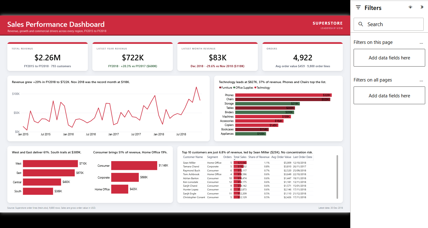
The model underneath was sound. A proper date table marked as a date table, a measure table, thirty-one measures with the time intelligence actually structured rather than bodged. It even wrote the chart titles as DAX measures, so every title on the page is a sentence computed from the data instead of typed by hand. "Technology leads at $827K, 37% of revenue." "Revenue grew +20% in FY2018 to $722K." That is a genuinely nice touch and I would not have got to it in 45 minutes.
So the analysis was fine. The thinking was fine.
And then you try to read it
Start with the sub-category bars. The value labels are white and they sit right at the end of each bar, so half of every number is on the coloured bar and the other half is on the white canvas. White text on a white background. The digits just disappear.
The top customers table has the same problem from a different direction. There are data bars behind the numbers, in red, running straight underneath the values they are meant to be describing. The number and the thing measuring the number end up fighting over the same pixels, and the number loses.
Then the categories, which is the one that actually bothers me. Technology is red, Furniture is a dark red, and those two are close enough that you have to go back to the legend every single time. Office Supplies is green. So it has taken a client brand palette that happens to contain a red and a green, and used it as a categorical scale, which puts a decent chunk of any audience straight out of the picture.
And all of it is small. The table text, the axis labels, the little grey captions under the cards. Fine on a laptop eighteen inches from your face. Useless on a screen at the end of a boardroom, which is exactly where a leadership dashboard lives.
None of that is a failure of analysis. Every number on that page is right. I checked. It is a failure of reading, and reading is most of the job.
What I actually took from it
The AI was given a palette and it used the palette. It was told the brand colours were red, dark red and green, and it went ahead and made red, dark red and green mean things.
A human would have stopped there. Not because we are cleverer, but because we have sat in the meeting where somebody squints at the back wall and asks which red is which. You take the brand colours, use one of them for emphasis, and let everything else go quiet. The palette is for the header and the one thing you want people to look at. It is not a set of category assignments.
That difference is smaller than the AI hype crowd think and bigger than the AI sceptic crowd think. It got to a competent, structurally sound, correctly calculated report in 45 minutes, which is not nothing. It just could not tell whether anybody could read it, because it has never watched someone try.
I have written before about whether you should replace Power BI with an AI-built dashboard, and this was the live-fire version of the same argument. The answer has not moved. Use it for the model, the measures, the boring structural work it is genuinely good at. Keep a person on the part where the thing has to be understood by somebody who did not build it.
The room, and the rest of it
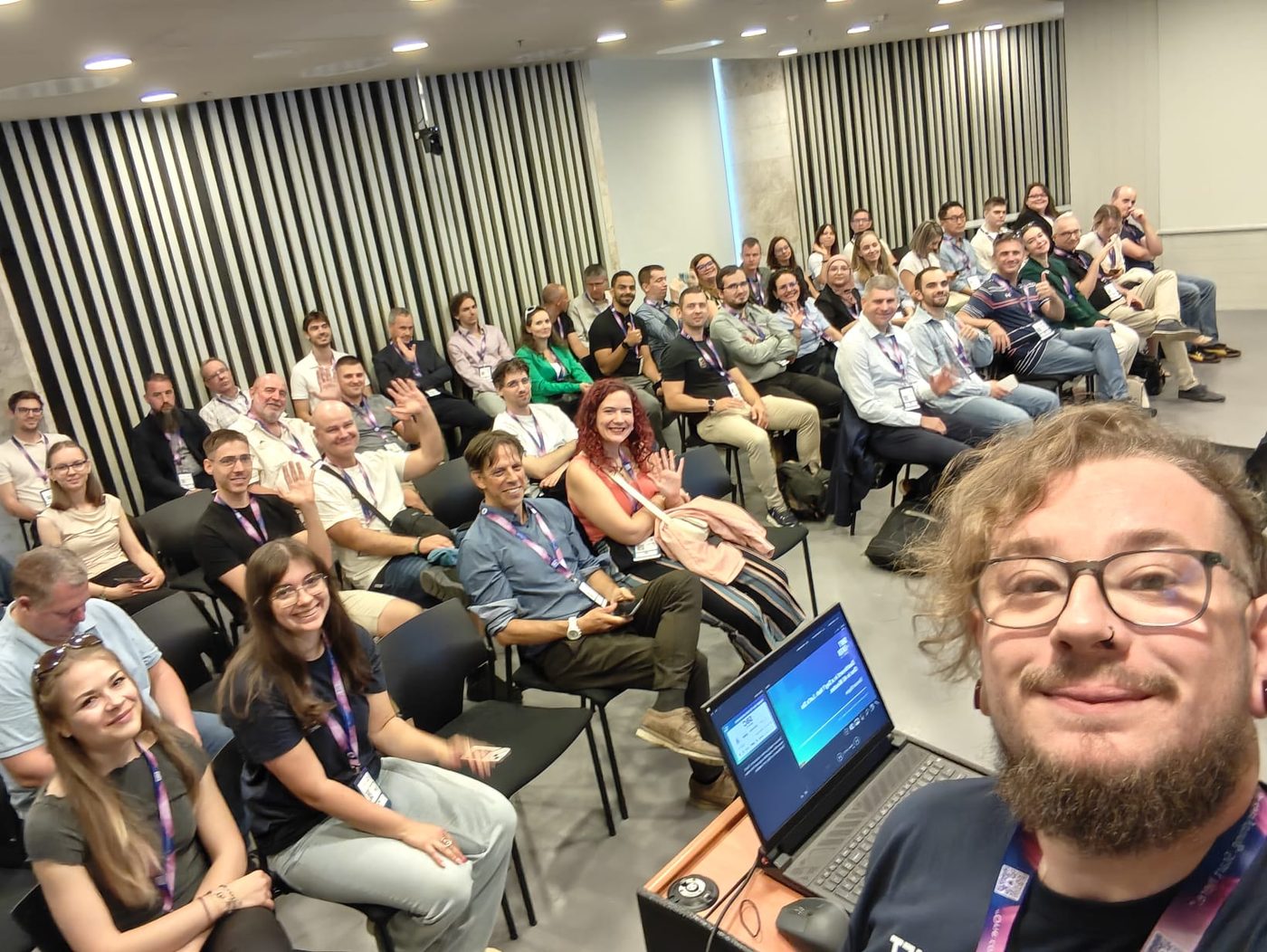
The room was great. Engaged, generous with the questions, and happy to sit through a live build with all the risk that carries.

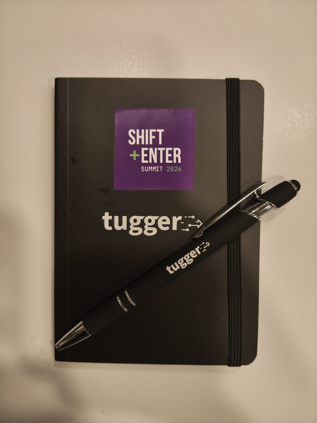
I also came home with the best conference notebook I have been given in a while, which is a low bar that this one cleared comfortably.
And then there is Budapest, which I did not give myself anywhere near enough time in. St Stephen's Basilica at dusk with the Ars Sacra banners up, and a square full of people just standing about looking at it. I stood about looking at it too, for longer than I meant to.

Thank you to the Shift+Enter team for having me, and to everyone who came and sat through a man racing a computer for three quarters of an hour.
Anyway. If you are building dashboards with AI, and plenty of you are, go and look at yours on the biggest screen you own from the far side of the room. That is the test it keeps failing.